Cracker Barrel's new logo isn't quite getting a stamp of approval from some customers.
The nationwide restaurant chain and country store, which is known for its comfort food and nostalgic atmosphere, unveiled a new, simplified logo with the launch of a fall menu campaign on Aug. 19.
In a news release for the campaign, called "All the More," Cracker Barrel boasted "refreshed restaurant remodels" and "an enhanced brand look and feel."
The updated visuals will appear across menus and marketing collateral, the company said in a statement.
While changes are here, Cracker Barrel told USA TODAY its "values haven't changed, and the heart and soul of Cracker Barrel haven't changed."
"Cracker Barrel has been a destination for comfort and community for more than half a century, and this fifth evolution of the brand's logo, which works across digital platforms as well as billboards and roadside signs, is a call-back to the original and rooted even more in the iconic barrel shape and word mark that started it all back in 1969," the company said.
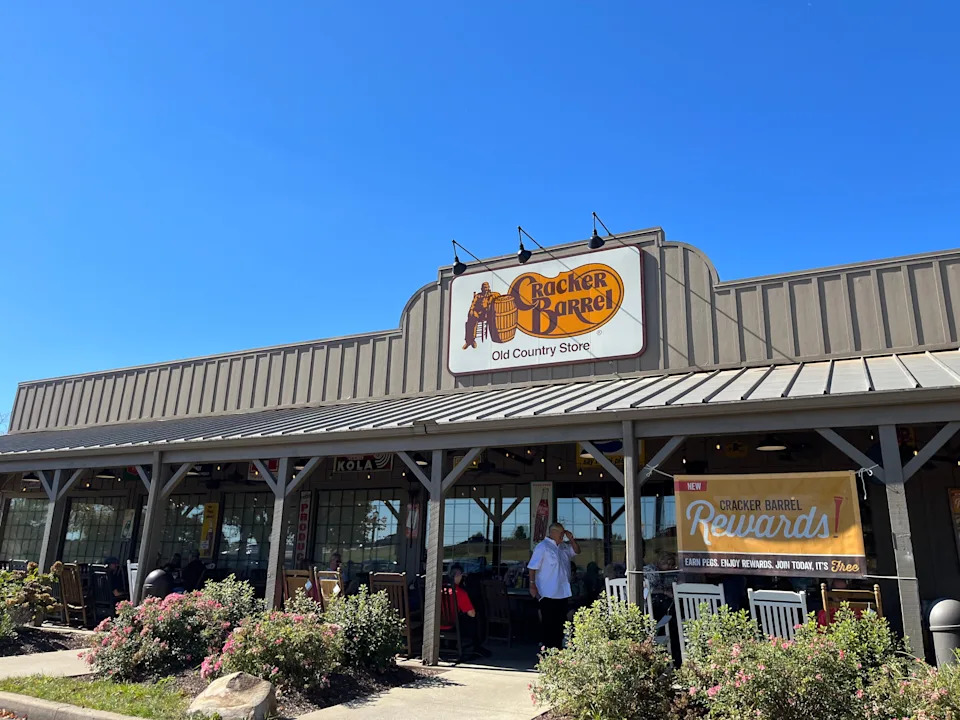
Cracker Barrel remodels restaurants Some Cracker Barrel fans share distaste with remodeled restaurants: 'Thanks, I hate it'
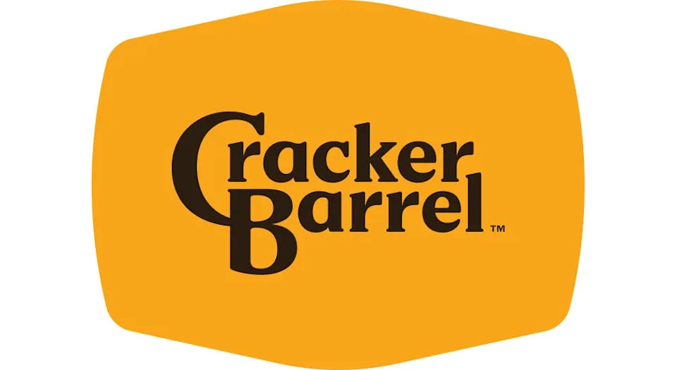
What does Cracker Barrel's new logo look like?
While still featuring the company's classic gold and brown color palette, the new Cracker Barrel logo instead offers a simplified version without a man seated next to a wooden barrel.
While still featuring the company's classic gold and brown color palette, the new Cracker Barrel logo instead offers a simplified version without a man seated next to a wooden barrel.
Despite recent online pushback against the renovations, Cracker Barrel CEO Julie Felss Masino said in an Aug. 19 interview on "Good Morning America" that "people like what we're doing."
"Cracker Barrel needs to feel like the Cracker Barrel for today and for tomorrow – the things that you love are still there," she said. "We need people to choose us, and we want people to choose us."
Some Cracker Barrel customers aren't happy with new logo: 'Cold and sterile'
Some longtime Cracker Barrel fans took to social media to express disappointment with the company's new logo, with some calling on the chain to change it back.
"The new rebrand took the feeling away," one person wrote on Cracker Barrel's Instagram. "Cold and sterile."
Another said, "I’m feeling like this new logo is ruining my life."
Some conservatives even pushed back against the rebrand, suggesting that the new logo is political.
"WTF is wrong with @CrackerBarrel??!" Donald Trump Jr. said in response to a post on X that implied the logo may be motivated by diversity, equity and inclusion efforts.
Other people are embracing the changes on social media.
"Cheers to the new logo!!!! We love you!" one Instagram commenter said.
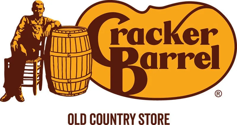
Who is the man in the old Cracker Barrel logo?
According to Cracker Barrel's website, the man in its old logo is not a specific person, but rather a representation of the brand.
"There's an image of a man relaxing by a cracker barrel, representing the old country store experience where folks would gather around and share stories," the website says. "Our logo reflects our roots and the warm, welcoming atmosphere we've always aimed to create."
In addition, the old logo featured the Cracker Barrel name up against a pinto bean shape, which was a nod to one of the restaurant's original sides, its website said.
Dan Evins, Cracker Barrel's founder, enlisted the help of Nashville-based designer Bill Holley to create the logo. Holley "sketched his first draft of the Cracker Barrel logo on a napkin," according to the company.
Cracker Barrel locations in Missouri
There are currently 17 Cracker Barrel restaurants in the Show Me State. Check out this interactive map to find the closest location near you:
Melina Khan is a national trending reporter for USA TODAY. She can be reached at [email protected].
This article originally appeared on Springfield News-Leader: Cracker Barrel unveils new logo: What can Missouri restaurants expect?

Comments